In the competitive job market of today, a well-crafted resume serves as your ticket to getting noticed by potential employers. Beyond just showcasing your skills and experiences, the aesthetics of your resume play a crucial role in capturing the attention of recruiters. In this blog post, we will delve into the importance of resume aesthetics and explore the do’s and don’ts, focusing on layout, font choices, and colour schemes from a recruiter’s perspective.
The Power of First Impressions
Recruiters often spend mere seconds scanning a resume, making the initial visual impact absolutely crucial. A visually appealing resume stands out from the sea of black-and-white text, immediately grabbing attention and encouraging the recruiter to delve deeper. A well-designed layout, thoughtful font choices, and a cohesive colour scheme can collectively contribute to a positive first impression.In the realm of job hunting, the significance of making a positive first impression cannot be overstated. Recruiters, inundated with countless resumes, devote only a fleeting moment to each. Consequently, the initial visual impact of your resume becomes a decisive factor in determining whether your application advances to the next stage of the hiring process.
a. Visual Differentiation:
Your resume serves as a representation of your professional identity. In a sea of monotonous black-and-white documents, a visually appealing resume acts as a beacon, signalling to recruiters that you understand the importance of presentation. This subtle yet impactful differentiation can elevate your application from being just another piece of paper to a visually engaging and memorable document.
b. Creating Engagement:
A well-designed layout, coupled with strategic font choices and a harmonious colour palette, creates an environment conducive to engagement. Recruiters are more likely to invest time in thoroughly reviewing a resume that is aesthetically pleasing and easy to navigate. This engagement becomes a bridge that connects your qualifications and experiences with the recruiter’s attention, increasing the likelihood of your profile being considered in depth.
II. Capturing Attention in Seconds:
Recruiters, pressed for time and with numerous resumes to sift through, often spend a mere 6-10 seconds on an initial scan. During this brief window, the visual appeal of your resume determines whether it stands out or is relegated to the reject pile. Understanding this reality underscores the importance of meticulous attention to aesthetics.
a. Scannability:
A visually appealing resume, in terms of layout, aids the recruiter in quickly scanning and extracting pertinent information. Headings, bullet points, and clear sections facilitate a rapid comprehension of your professional journey. By optimizing your layout for quick assimilation, you increase the likelihood of capturing the recruiter’s interest within those critical seconds.
b. Professionalism Perception:
The visual presentation of your resume can be seen as a reflection of your professionalism and attention to detail. A well-organized and visually appealing document suggests that you not only possess the requisite qualifications but also understand the nuances of effective communication. Conversely, a poorly structured or visually unappealing resume may inadvertently convey a lack of diligence, potentially undermining the credibility of your professional narrative.
III. Establishing Visual Hierarchy:
An aesthetically pleasing resume is more than just an arrangement of words and bullet points; it’s a carefully curated visual hierarchy that guides the recruiter’s eyes through the most important elements. This hierarchy is instrumental in directing attention to key information and ensuring that your accomplishments and skills are prominently featured.
a. Headings and Subheadings:
Strategic use of headings and subheadings creates a clear visual hierarchy, highlighting key sections such as “Professional Experience,” “Skills,” and “Education.” This not only streamlines the information but also facilitates a seamless reading experience for the recruiter.
b. Font Emphasis:
The choice of fonts and their variations contributes to establishing a visual hierarchy. Bold fonts for headings and italicized or regular fonts for body text help guide the recruiter’s eyes through the content, emphasizing crucial details and maintaining readability.
In conclusion, the power of first impressions cannot be understated in the context of resume crafting. By understanding and harnessing the visual elements of your resume, you not only capture the recruiter’s attention but also convey a sense of professionalism and thoughtfulness that can set you apart in a competitive job market. Remember, your resume is more than a list of qualifications; it’s your personal brand, and a visually appealing presentation is the key to making that memorable first impression.
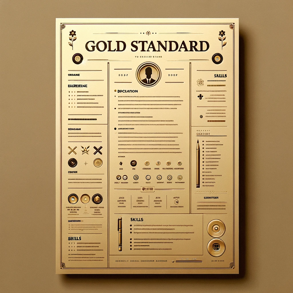
Crafting an Organized Layout
The layout of your resume is the canvas upon which your professional story is painted. A cluttered and disorganized layout can be overwhelming for recruiters, making it difficult for them to extract relevant information quickly.
a. Hierarchy of Information:
Establishing a clear hierarchy is crucial for guiding the recruiter’s eyes through your resume. Begin with a bold and distinct header containing your name and contact information. Follow this with well-defined sections such as “Professional Experience,” “Skills,” “Education,” and “Additional Sections” in a logical sequence. This hierarchy ensures that the recruiter can quickly locate and navigate through essential details.
b. Section Headings and Subheadings:
Employ clear and descriptive section headings to introduce each segment of your resume. Use bold or slightly larger font sizes for headings and subheadings to visually distinguish them from the body text. Subdivide sections further if needed, creating a hierarchy that makes it easy for the recruiter to identify and digest information.
c. Consistent Spacing and Alignment:
Consistency in spacing and alignment contributes to a polished and organized appearance. Ensure even spacing between sections, headings, and bullet points to avoid visual clutter. Maintain a uniform left or center alignment for text to create a neat and professional look. Consistent spacing and alignment enhance readability and give your resume a cohesive visual appeal.
d. Bullet Points for Readability:
Instead of dense paragraphs, use bullet points to present information concisely and improve readability. Bullet points create a clean and scannable format, allowing recruiters to grasp key details quickly. Begin each bullet point with action verbs to convey your achievements and responsibilities in a compelling manner. This not only enhances clarity but also adds a dynamic element to your resume.
e. Whitespace:
Embrace the power of whitespace. A balanced distribution of text and whitespace prevents visual overload and contributes to a harmonious layout. Whitespace, when strategically utilized, allows the eyes to rest and focus on essential information. Avoid the temptation to fill every inch of the page; instead, let whitespace guide the recruiter’s attention to what matters most.
f. Logical Chronological Order:
Arrange your professional experiences and educational background in a logical chronological order. Typically, the reverse-chronological format—listing the most recent experiences first—works well for most resumes. This chronological order not only follows a natural progression but also makes it easier for recruiters to understand your career trajectory.
g. Use of Columns and Grids:
Consider using columns or a grid layout, especially if you have diverse sections or want to emphasize specific skills or accomplishments. This technique can create a visually appealing structure while maintaining a sense of organization. However, exercise caution to avoid overcrowding or making the layout overly complex.
h. Visual Consistency:
Maintain visual consistency in fonts, font sizes, and formatting throughout your resume. Consistency reinforces the organized nature of your document and enhances its professional appearance. Avoid abrupt changes in style or formatting that may disrupt the visual flow and distract the recruiter.
By meticulously attending to the organization of your resume layout, you create a document that not only conveys information effectively but also presents you as a candidate who values clarity and professionalism. Crafting an organized layout is a fundamental step in ensuring that your resume becomes a visually appealing and easily navigable roadmap of your professional journey.
The Art of Font Choices
The fonts you choose for your resume are not merely stylistic decisions; they are integral components that influence the overall tone, readability, and professionalism of your document. Font choices play a pivotal role in making your resume visually appealing while ensuring that the content remains easily digestible. Here’s a detailed exploration of the do’s and don’ts when it comes to selecting fonts for your resume:
a. Do: Prioritize Readability with Classic Fonts:
- Opt for Timeless Choices: Choose classic and widely accepted fonts such as Arial, Calibri, or Times New Roman. These fonts are known for their readability and have stood the test of time in professional documents.
- Consistent Font Sizes: Maintain a consistent font size throughout your resume. Use larger fonts for section headings and slightly smaller ones for body text. This creates a hierarchy, guiding the reader through your resume seamlessly.
b. Don’t: Experiment with Overly Decorative or Unprofessional Fonts:
- Avoid Comic Sans or Papyrus: These fonts are often associated with informality and are not suitable for professional documents. Stick to fonts that convey a sense of professionalism rather than detracting from it.
- Overly Stylized Fonts: While unique fonts can be eye-catching, overly stylized or elaborate fonts can be challenging to read and may give your resume an unpolished appearance.
c. Do: Consider Modern and Elegant Alternatives:
- Sans-serif Fonts for a Contemporary Look: Sans-serif fonts like Helvetica or Lato can provide a modern and clean aesthetic. They are often favored for tech, design, and creative industries.
- Elegant Serif Fonts: If you prefer a more traditional look, consider serif fonts like Garamond or Georgia. These fonts can convey a sense of sophistication and are suitable for industries with a more formal tone.
d. Don’t: Mix Too Many Fonts:
- Font Cohesion: Stick to one or, at most, two complementary fonts for your entire resume. Mixing too many fonts can create a chaotic appearance and distract the reader from the content.
- Inconsistent Font Styles: Maintain consistency in font styles. If you choose a bold or italic style for headings, apply it consistently throughout the document. Consistency contributes to a polished and professional look.
e. Do: Emphasize Important Information:
- Bold for Emphasis: Use bold font for section headings, job titles, or company names to add emphasis and guide the reader’s attention to crucial information.
- Italics for Variety: Employ italics sparingly for titles of publications, certifications, or to differentiate specific details. Italics can add variety to your resume without sacrificing readability.
f. Don’t: Sacrifice Readability for Creativity:
- Tiny or Extravagant Fonts: Avoid using excessively small fonts or those that are difficult to read. Your resume should prioritize clarity over creative flair.
- Script or Handwritten Fonts: While these fonts may seem unique, they are often challenging to read and can be perceived as unprofessional in a formal document like a resume.
g. Do: Test for Compatibility:
- Cross-Platform Compatibility: Ensure that the fonts you choose are widely available and compatible across different devices and platforms. This is especially crucial as many recruiters may view resumes on various systems.
- PDF for Font Preservation: If you use non-standard fonts, consider saving your resume as a PDF to preserve the formatting, ensuring that it appears as intended regardless of the device used for viewing.
In essence, the art of font choices in your resume involves striking a balance between professionalism, readability, and a touch of visual appeal. By adhering to these do’s and avoiding the don’ts, you can ensure that your font choices contribute positively to the overall aesthetics of your resume, presenting you as a candidate who pays attention to detail and understands the importance of effective communication.
Harnessing the Power of Colors
Colour can be a powerful tool to enhance the visual appeal of your resume, but it should be used judiciously. When employed thoughtfully, colours can highlight important information and create a visually pleasing aesthetic.Color, when used thoughtfully, can transform your resume from a monochromatic document into a visually engaging and memorable representation of your professional brand. The strategic use of colours not only adds aesthetic appeal but can also emphasize key information and create a cohesive visual identity. Here’s a comprehensive guide on harnessing the power of colours in your resume:
a. Do: Use a Restrained Color Palette:
- Professional Tones: Opt for a restrained and professional colour palette. Classic colours such as navy blue, deep green, or burgundy convey sophistication, while muted tones like light gray or beige can add a touch of elegance.
- Alignment with Industry: Consider the norms of your industry when selecting colours. Creative fields may allow for more vibrant options, while conservative industries may require a subtler approach.
b. Don’t: Overwhelm with a Riot of Colors:
- Limited Colour Choices: Avoid using too many colours as it can overwhelm the reader. Stick to two or three complementary colours that enhance readability and maintain a clean aesthetic.
- Bright or Clashing Colours: Vibrant or clashing colours can be distracting. Ensure that your colour choices enhance rather than detract from the professionalism of your resume.
c. Do: Accentuate Key Elements:
- Use Color for Headings and Borders: Apply colour strategically to headings or section borders to create visual interest. This can help guide the reader’s eyes and highlight crucial sections.
- Colour-Coded Categories: Assign specific colours to different categories (e.g., work experience, education) for a well-organized and visually appealing layout. This adds a layer of coherence to your resume.
d. Don’t: Compromise Readability:
- Contrast for Legibility: Ensure that text remains easily readable against coloured backgrounds. High contrast between text and background is essential to prevent visual strain and maintain accessibility.
- Too Light or Too Dark: Avoid using extremely light or dark colours for text, as it may affect readability. Test your colour choices on different screens to confirm their visibility.
e. Do: Align with Branding and Industry:
- Personal Branding: If you have a personal brand colour associated with your professional identity, consider incorporating it into your resume. This fosters consistency across your personal and professional presentation.
- Industry Relevance: Align your colour choices with the conventions of your industry. For example, earthy tones may be suitable for environmental or sustainable industries, while tech or creative fields might embrace more vibrant options.
f. Don’t: Rely Solely on Colors:
- Accessibility with Black-and-White Printing: Keep in mind that your resume might be printed in black and white. Ensure that it retains its clarity and professionalism even without the use of colours.
- Colour-Dependent Information: Avoid relying on colours alone to convey critical information. Use colour as a supplementary element, with the understanding that not all readers may perceive it.
g. Do: Create Visual Harmony:
- Consistency in Colour Application: Maintain consistency in the application of colours throughout your resume. This creates visual harmony and reinforces a sense of cohesion in your document.
- Subtle Accents: Use colour as subtle accents rather than dominant features. This approach adds a touch of flair without overwhelming the overall design.
h. Don’t: Use Colours Unintentionally:
- Random Color Placement: Avoid using colours without intention. Every colour choice should have a purpose, whether it’s to highlight specific achievements, delineate sections, or enhance overall aesthetics.
- Inconsistent Colour Usage: If you choose to use colour, ensure that it is applied consistently. Inconsistency can create a disjointed visual experience for the reader.
i. Do: Test and Adapt:
- Cross-Device Compatibility: Test your resume on various devices to ensure that the colours appear as intended. What looks appealing on your computer screen may appear differently on a tablet or smartphone.
- Solicit Feedback: Seek feedback from peers or mentors regarding your colour choices. Different perspectives can provide valuable insights into the effectiveness of your colour palette.
In conclusion, using colours can elevate your resume, capturing attention and reinforcing your brand. By adhering to these do’s and avoiding the don’ts, you can harness the power of colours to create a visually appealing document that stands out and communicates professionalism and attention to detail.
Mobile-Friendly Design
In the digital age, it’s crucial to consider the mobile-friendliness of your resume. Many recruiters view resumes on mobile devices, and a poorly formatted document can hinder accessibility. In an era of ubiquitous smartphones and tablets, a mobile-friendly resume design is no longer just a nicety but a necessity. Many recruiters and employers review resumes on mobile devices, and a design that translates seamlessly to smaller screens is crucial for making a positive impression. Here’s a detailed exploration of the do’s and don’ts when it comes to crafting a resume with mobile-friendliness in mind:
a. Do: Optimise for Readability on Small Screens:
- Clear and Concise Content: Ensure that your content is concise and to the point. Mobile users prefer easily digestible information, so focus on the most relevant details.
- Larger Font Sizes: Use font sizes that remain legible on smaller screens. What looks clear on a desktop may appear tiny on a mobile device, so adjust accordingly.
b. Don’t: Neglect Formatting for Smaller Screens:
- Avoid Clutter: Streamline your content for mobile viewing. Avoid excessive details and prioritize essential information to prevent visual clutter.
- Overly Complex Layouts: Steer clear of intricate layouts that may not translate well to smaller screens. A clean and straightforward design ensures a seamless mobile experience.
c. Do: Use a Simple and Adaptable Layout:
- Single-Column Design: Opt for a single-column layout to simplify the reading experience. This design adapts well to various screen sizes and ensures a smooth vertical scroll.
- Consistent Spacing: Maintain consistent spacing between sections and elements. This not only enhances readability but also contributes to a visually appealing mobile layout.
d. Don’t: Complicate Navigation:
- Avoid Horizontal Scrolling: Minimize the need for horizontal scrolling, which can be cumbersome on mobile devices. Ensure that users can navigate your resume vertically without encountering navigation challenges.
- Excessive Hyperlinks: While hyperlinks are useful, avoid relying on them excessively. Mobile users may find it challenging to click on small links, potentially missing crucial information.
e. Do: Test on Various Devices and Platforms:
- Cross-Device Compatibility: Test your resume on different devices and platforms to ensure that the formatting remains consistent. What looks polished on one device may encounter display issues on another.
- PDF Format for Preservation: Save your resume as a PDF to preserve formatting across devices. PDFs are generally more stable and maintain consistency in appearance.
f. Don’t: Sacrifice Visual Appeal:
- Maintain Aesthetic Appeal: Just because a resume is mobile-friendly doesn’t mean it has to sacrifice visual appeal. Strive for a balance between simplicity and a visually engaging design.
- Low-Resolution Images: If you include images, ensure they are optimised for mobile viewing. High-resolution images can slow down the loading time and affect the user experience.
g. Do: Prioritize Essential Information:
- Place Important Details Early: Put crucial information, such as your name, contact information, and a brief summary, towards the top of the resume. Mobile users often make quick decisions, so ensure that the most pertinent details are readily accessible.
- Highlight Key Achievements: Emphasize key achievements in each section, allowing recruiters to quickly grasp your qualifications without extensive scrolling.
h. Don’t: Ignore Mobile Responsiveness:
- Responsive Design Elements: Ensure that your resume design is responsive. Elements should adjust fluidly to different screen sizes, providing an optimal viewing experience on various devices.
- Unreadable Text: Avoid using small fonts or densely packed text that may become unreadable on smaller screens. Legibility is paramount for a mobile-friendly resume.
i. Do: Incorporate Mobile-Friendly File Formats:
- PDF as the Preferred Format: While Word documents are commonly used, consider saving your resume as a PDF for mobile compatibility. PDFs maintain formatting and are generally easier to view on different devices.
- Online Profiles and Links: If you include links to online profiles, make sure they are easily clickable on mobile devices. Consider using shortened URLs to maintain a clean appearance.
In conclusion, a mobile-friendly resume design is an essential component of a successful job application strategy. By implementing, these do’s and avoiding the don’ts, you can ensure that your resume is not only visually appealing but also optimized for seamless viewing on the devices where recruiters often review applications. This approach demonstrates adaptability and a commitment to providing an excellent user experience, further enhancing your chances of making a positive impression.
Your Resume, Redefined by Resumofy Resumofy brings AI efficiency to resume building. Create customized resumes, manage applications, and evaluate your resume with ML technology. Generate AI-driven cover letters to complement your application. Embark on your career journey with Resumofy. Also, read Resume Follow-Up Strategies: Ensuring Your Application Gets Noticed